- Get link
- X
- Other Apps
- Get link
- X
- Other Apps
By Yahia El-Shall
The last post discussed how to create a pivot chart. Now that we have our pivot table, we want to visualize our data through a chart.
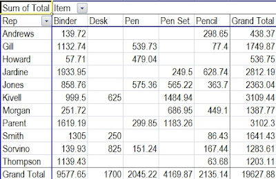
Here is a screenshot of our pivot table that we created previously.
Insert Pivot Chart
To insert a pivot chart, all you have to do is insert a chart.
1. Click your mouse on any cell inside the pivot table.
2. Go to the Insert tab. Click the chart type you want in the Charts group and then select your subtype.
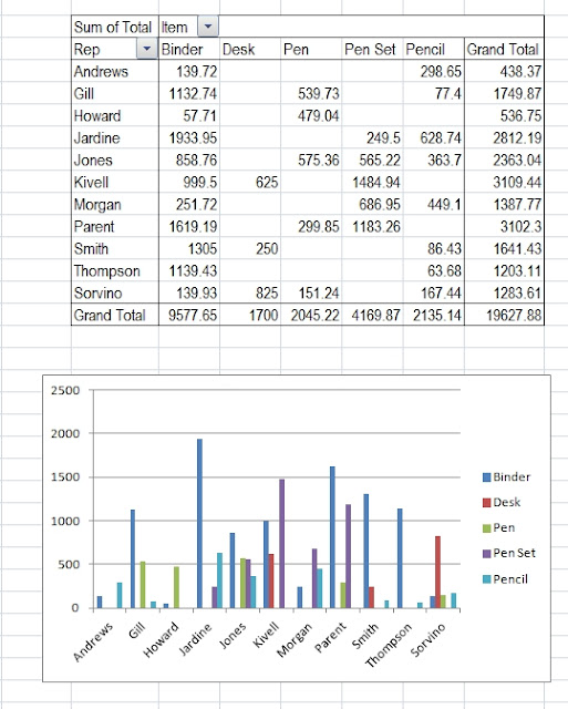
Now we've inserted our pivot chart illustrating the dollar amounts / item sold by our sales representatives.
You can modify your chart with an appropriate title and labels for your x and y axis.
Our next post will examine how to filter a pivot chart to refine the data displayed even further.


Comments
Post a Comment